 There's a volcano in my kitchen almost every night. That's where I sit to use my laptop.
I have been tracking Redoubt volcano in Alaska for the past several months. The Alaska Volcano Observatory as been using a Twitter feed (@avo_alaska) and their web site to share information on the increasing activity, and then eruption, of the volcano. Of course, there is news coverage anytime a volcano erupts near a populated area, but this one is different because of both the amount of information available and the ease with which it can be acquired. The picture at right is from the Hut webcam, one of three regularly updated images of the volcano available at the AVO website. The combination of the Twitter feed and webcam feeds provide an almost real-time stream of information, both text and images, from the volcano and have made it possible to have a much more personal experience of this eruption than for previous eruptions, accessible only through the media's coverage. In addition, the technology available is improving very rapidly.
Recently, AVO installed a new webcam at their Hut site - this cam is now zoomed in on the crater, showing the lava dome you can see in the image above. The camera's resolution is high enough to see the geometry of cracks in the surface of the growing lava dome and sensitive enough to detect incandescence in the dome at night. That's amazing! I can probably see more detail at my kitchen counter than I could if I were standing at the Hut station myself, unless I had a zoom lens or binoculars with me there.
I've taken courses on volcanology in graduate school and read professional papers on volcanoes, but I have still learned a tremendous amount about the evolution of a lava dome and especially about the time scales of activity from this day-by-day experience. I've also learned a bunch about related topics, such as the weather in southern Alaska (it's cloudy more than it's clear at Redoubt this time of year and there are frequent snowfalls).
Now consider the image below:
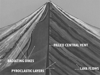 This is the image that most students get of this type of volcano. This one is from a USGS
online book about volcanoes, but there is little difference between this image and most earth science textbooks. There are things in this image that cannot be seen in the picture that led off this post, so it is important to have students see this sort of image. The trouble is that there is nothing about this image that grabs you. There is no immediacy and no reality. It is clearly a cartoon.
The active photo, especially when it changes from minute to minute, hour to hour, and day to day, has an immediacy and reality that this does not. It also has detail that this does not. The real-life picture shows the gasses being vented and even a thin gray smear of ash coming off the middle of the dome in front of all that condensed steam. It clearly shows that there are no lava flows associated with this event, but that there is a debris apron around the dome and also that there is an impact on hydrology (water in the stream draining from below the dome.) None of this is in the textbook picture. The real world picture is much more complex than the pre-digested textbook picture. That means it is harder to interpret, but it also makes it a much richer springboard for inquiry.
Dan Meyer has inspired me with his "What can you do with this?" sequence on the use of real-life images and video to teach mathematics. It also ties into a question I learned from a talk by Don Duggan-Haas at GSA - "Why does this place look this way?" I would love to see more science teachers using this kind of real world data to promote student engagement and student inquiry. So let me pose that question to you readers - what can you do with the image at the top of this page? Also, do you have images that you think are good prompts for open-ended exploration, measurement, or other forms of inquiry? Please share in the comments.
PS: Here's another AVO image: http://www.avo.alaska.edu/image.php?id=18224 This one has a scale in it and shows the prominent waterfall in the gorge below the dome (altough the scale only roughly applies to the dome, due to the horizontal separtion of the dome from the falls). Interestingly, that "little" waterfall is roughly twice the height of Niagara Falls!
On June 16th Eruptions blog http://scienceblogs.com/eruptions/2009/06/sarychev_peak_eruption_update_1.php posted a great set of satellite images of ash plumes from Sarychev volcano in the Kuril Islands. Just another example of a great data set that can form the springboard to inquiry.
ReplyDelete